Fatherly
I joined the Fatherly team in 2017 with the challenge of developing a unique, cohesive visual language to boldly express the brand’s voice wherever readers might encounter it. Over the years, the direction I created for on-site art lead the way for creating social media assets, emails, and more.

The goal:
To create a visual environment that is aspirational and imaginative while still grounded in reality of parenting.
And it looks like no other parenting brand.

Working with back-end constraints
The CMS in use at Fatherly required long, short images for feature headers. The site automatically cropped headers to centered squares when a story was placed into the hero module on the home page.
I designed headers with these restrictions in mind; knowing that the image would also have to crop in a way that makes sense when shared on social channels.
Sometimes restrictions (like, “hey, you have to pretty much always use a very centered composition”) allow the for more creative solutions. It also underlined the need to keep images easy to understand at a glance.
Win-Win!

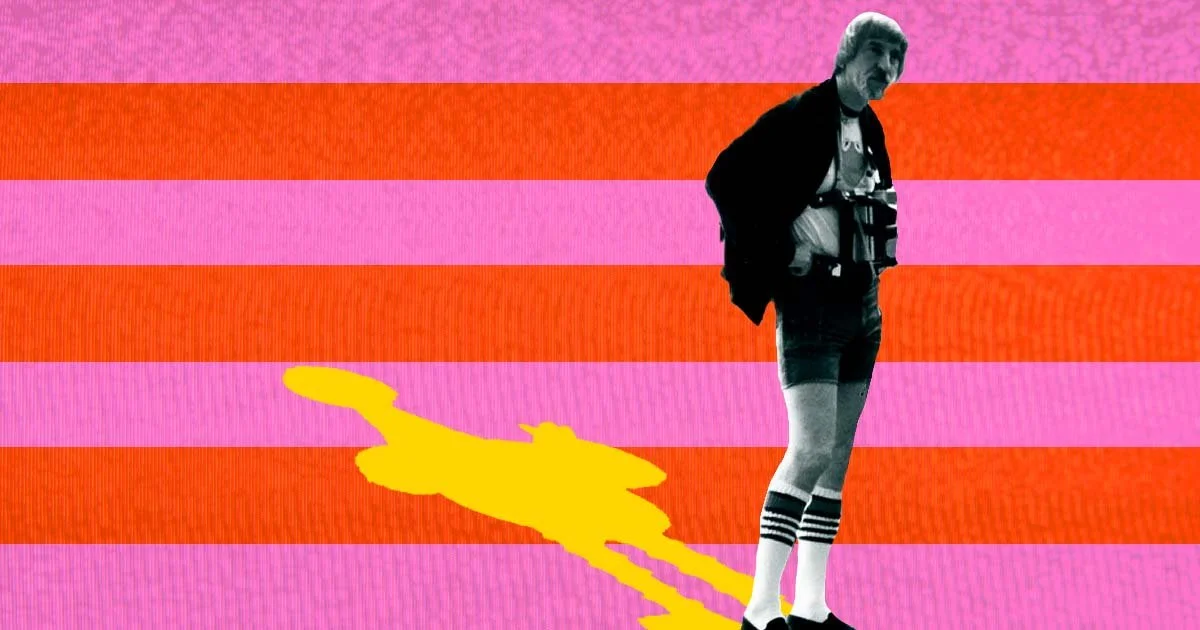
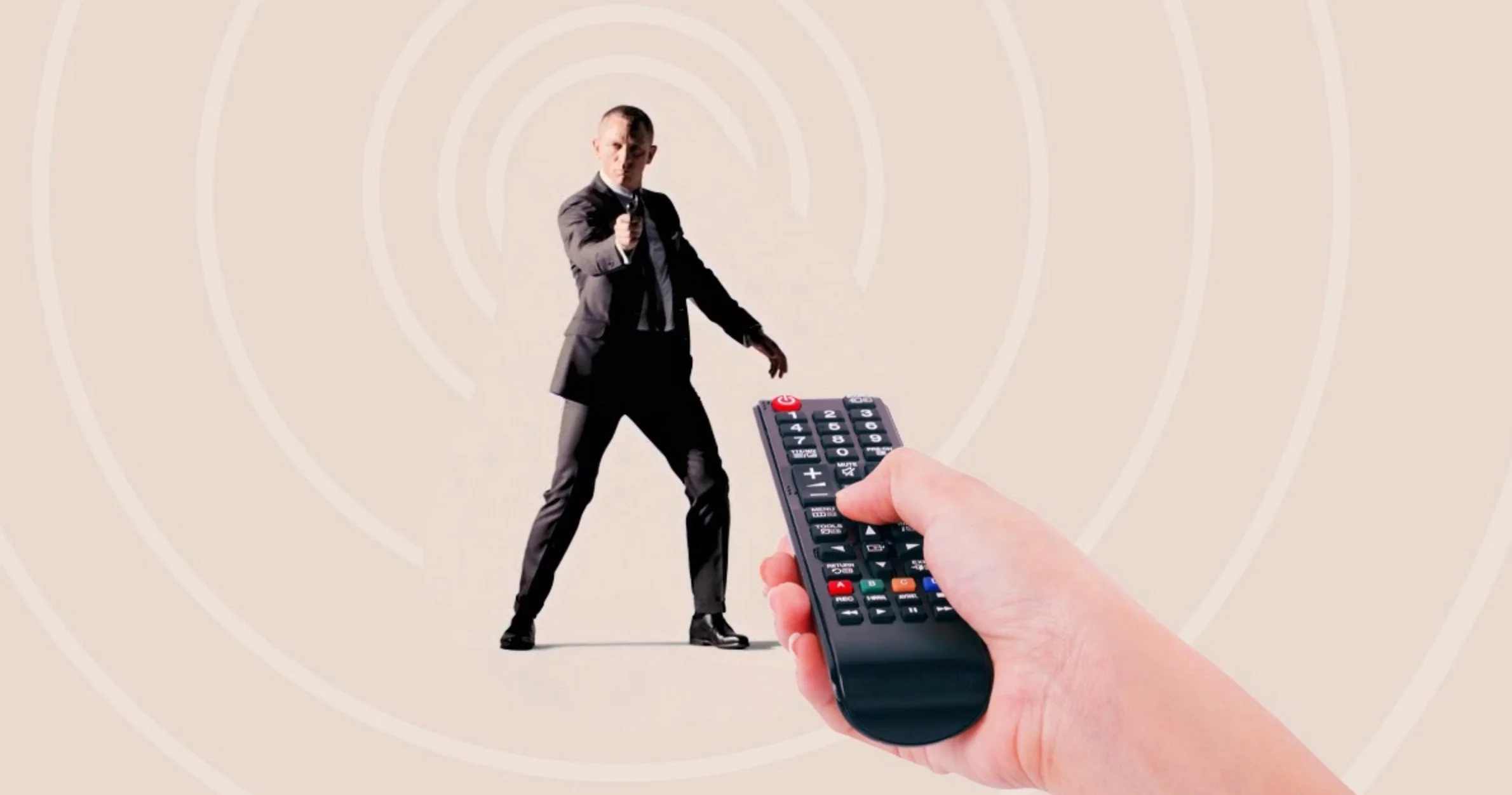
Entertainment Headers
The ‘Play’ vertical gave me an opportunity to inject fun into the site’s visuals. Bright and eye-catching color combinations enhance unexpected collages and concept-driven image mash-ups. Ensuring famous faces remain recognizable in the article header image helps these stories succeed on social channels.

SEO & Parenting Content
For content whose primary traffic entrances came from search, I created simple graphic treatments in a system built to optimize efficiency of the article production workflow.
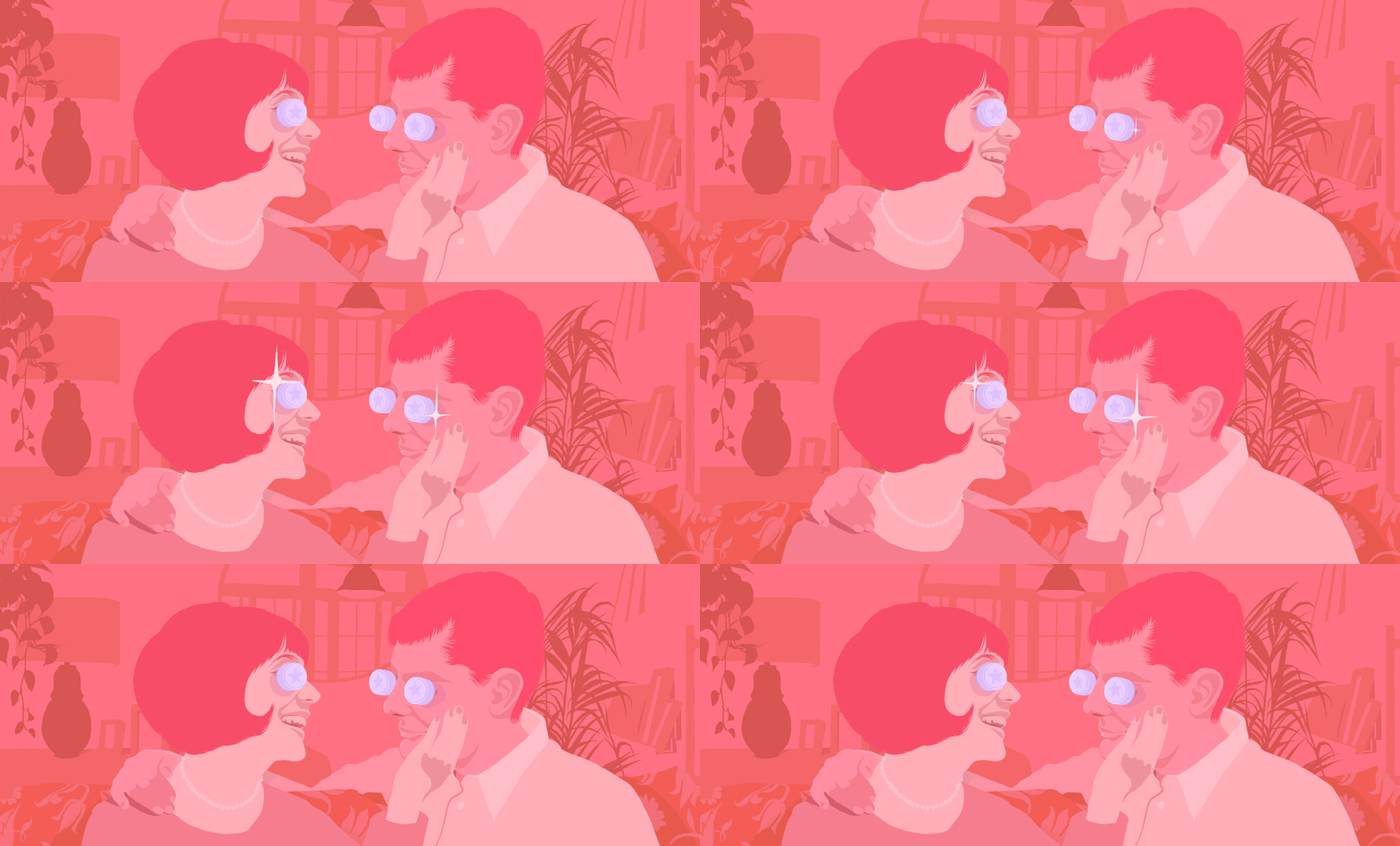
For the parenting vertical, the graphic treatment literally highlights the child in stock photographs depicting everyday parenting life.
To create a cohesive visual language, we repeat elements or approaches such as color overlay and silhouette across sections.
Illustration
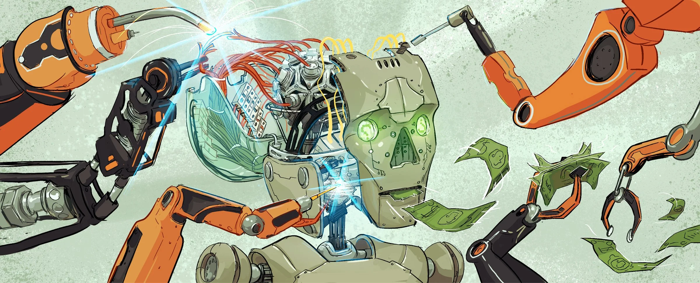
Fatherly illustrations can generally be described as human-made, rough lined, with an unpolished feel. These editorial illustrations don’t tell the whole story of the article, or even interpret the sentiment of the headline. Instead they visualize worlds where the emotional anchor of the story is paramount.
I art directed illustrators to create artwork for editorial, branded, and sponsored projects. Some of my favorites include Bank of Dad, Dad Bod, and Coolest Dads.
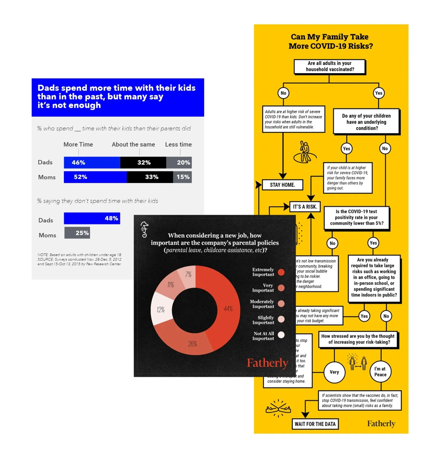
Data Visualization
Fatherly infographics use bold but friendly typography, and variations on brand colors. As creation of infographics is very time-intensive, simple modular compositions are employed and turned into customizable templates. To ensure legibility (especially on mobile), textures and photographs don’t generally come into play, but icons occasionally do.
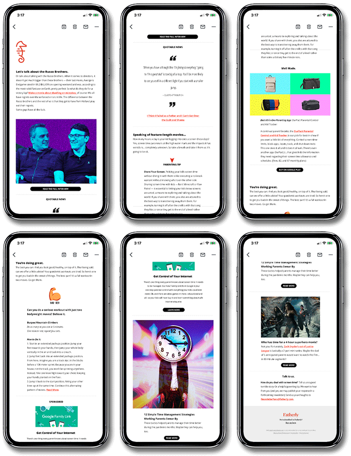
Newsletter
In 2021, the Fatherly Editor-in-Chief requested updated designs for a new daily newsletter, focused more on skimmable website content, rather than just a series of links.
I introduced a modular system with customizable sections that could be rearranged to create fresh combinations as needed. The clean design with a limited color palette gives the reader a more streamlined experience and helps the email feel like a premium content offering.

Finding Fred Podcast
Launching in 2019, Finding Fred is a podcast about the beloved childhood tv neighbor Mister Rogers. The show made it to the top of the Apple Podcast app/iTunes and was nominated for that year’s Peabody award.
I designed the podcast cover and corresponding artwork, building on the Fatherly aesthetic while centering Mister Rogers’ iconic red sweater. To make the podcast logo, I edited letterforms from the Mister Rogers’ Neighborhood title card, making the cover art immediately recognizable to a generation raised on the show.




Series Logos
Logos for tentpole editorial projects, licensable awards, and content libraries help visually categorize stories and put a literal Fatherly stamp on them. The logos are all about fun, cleverness, and even a bit of cool.
