More than mountains
Colorado Tourism partnered with Blue Apron and Atlas Obscura to bring the burgeoning Colorado food scene to new audiences–and their kitchens.
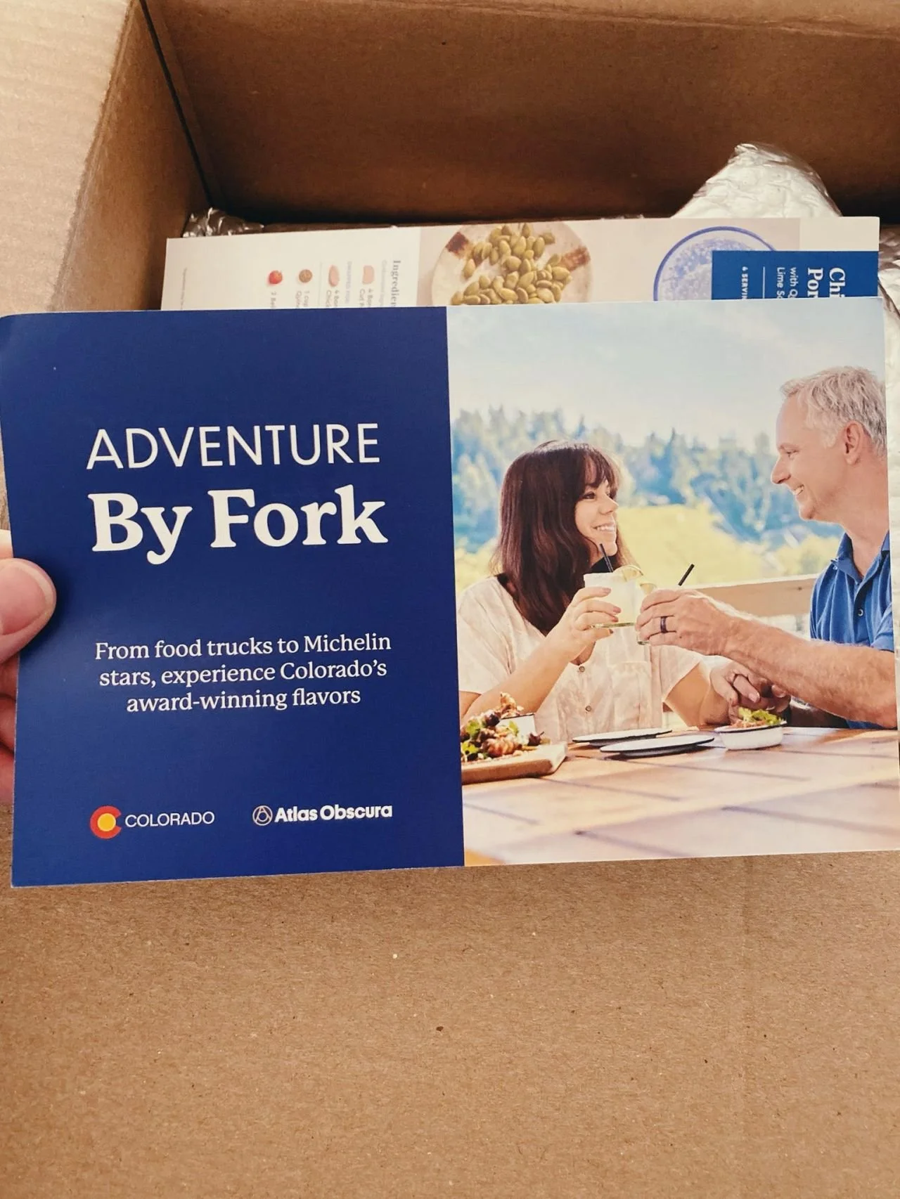
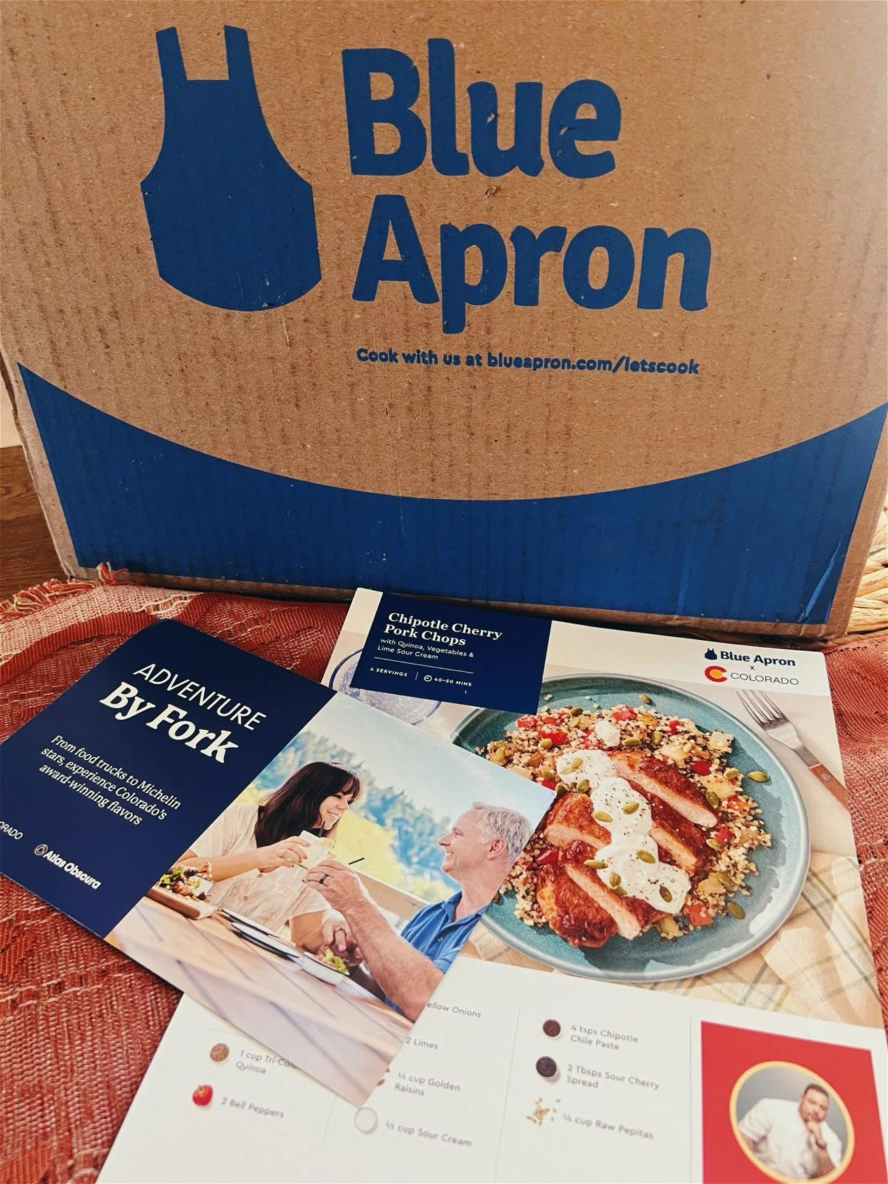
My job was to design a printed card that would be inserted into current customers’ subscription boxes alongside the usual recipe cards. These cards would announce the Blue Apron collaboration with Colorado chef Brother Luck, who had created a new recipe highlighting Coloradan ingredients. The goal was to connect the adventurous spirit Colorado is known for with its exciting new food scene.
And, of course, to sell those subscription boxes.
Get a glimpse of my design process below.
Creative Director Rachel Abady, Atlas Obscura
Graphic Designer Anne Meadows, Atlas Obscura
Client Mira Bogart, Manager, Account Supervisor at MMGY Global
01 RESEARCH
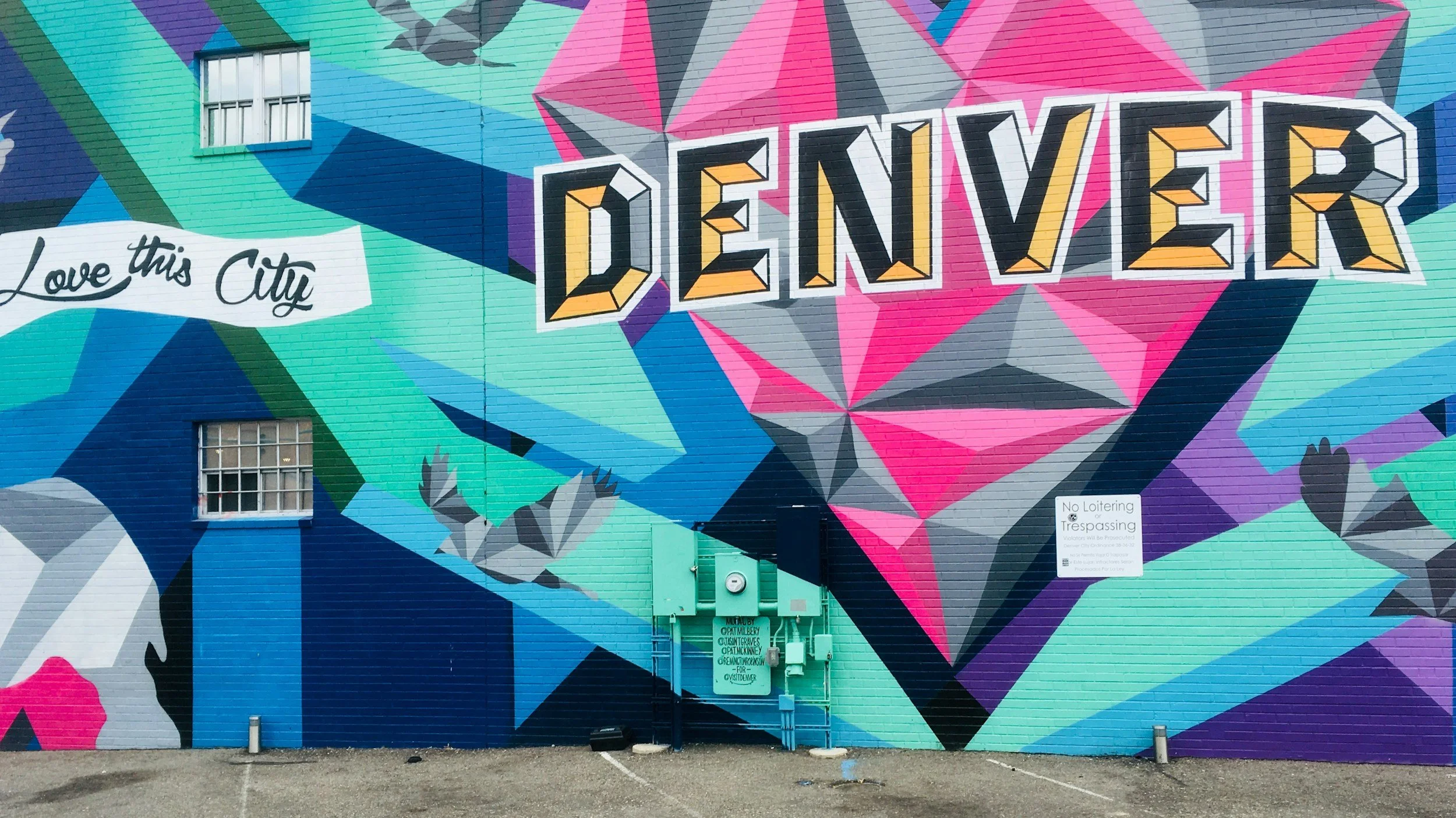
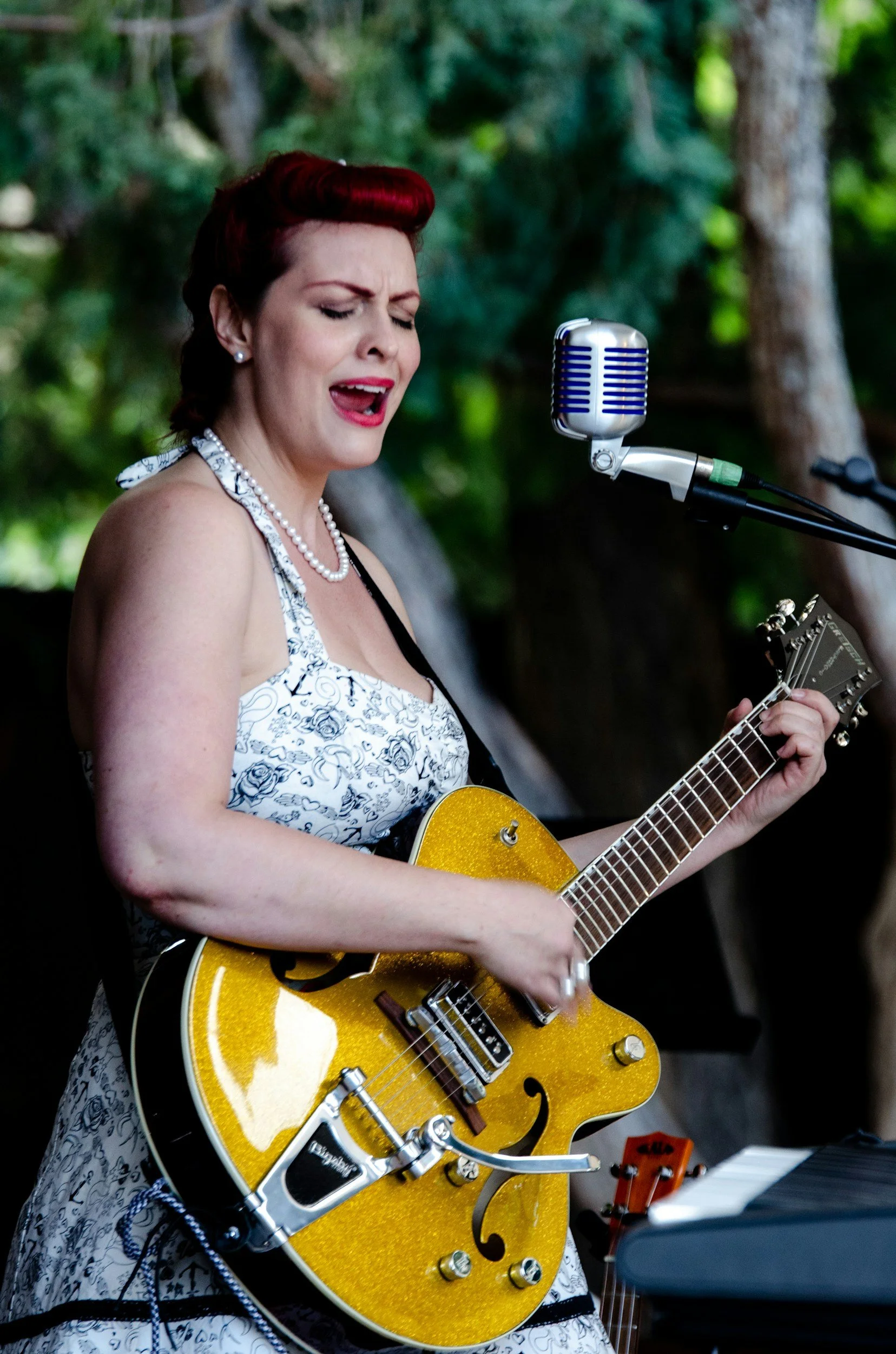
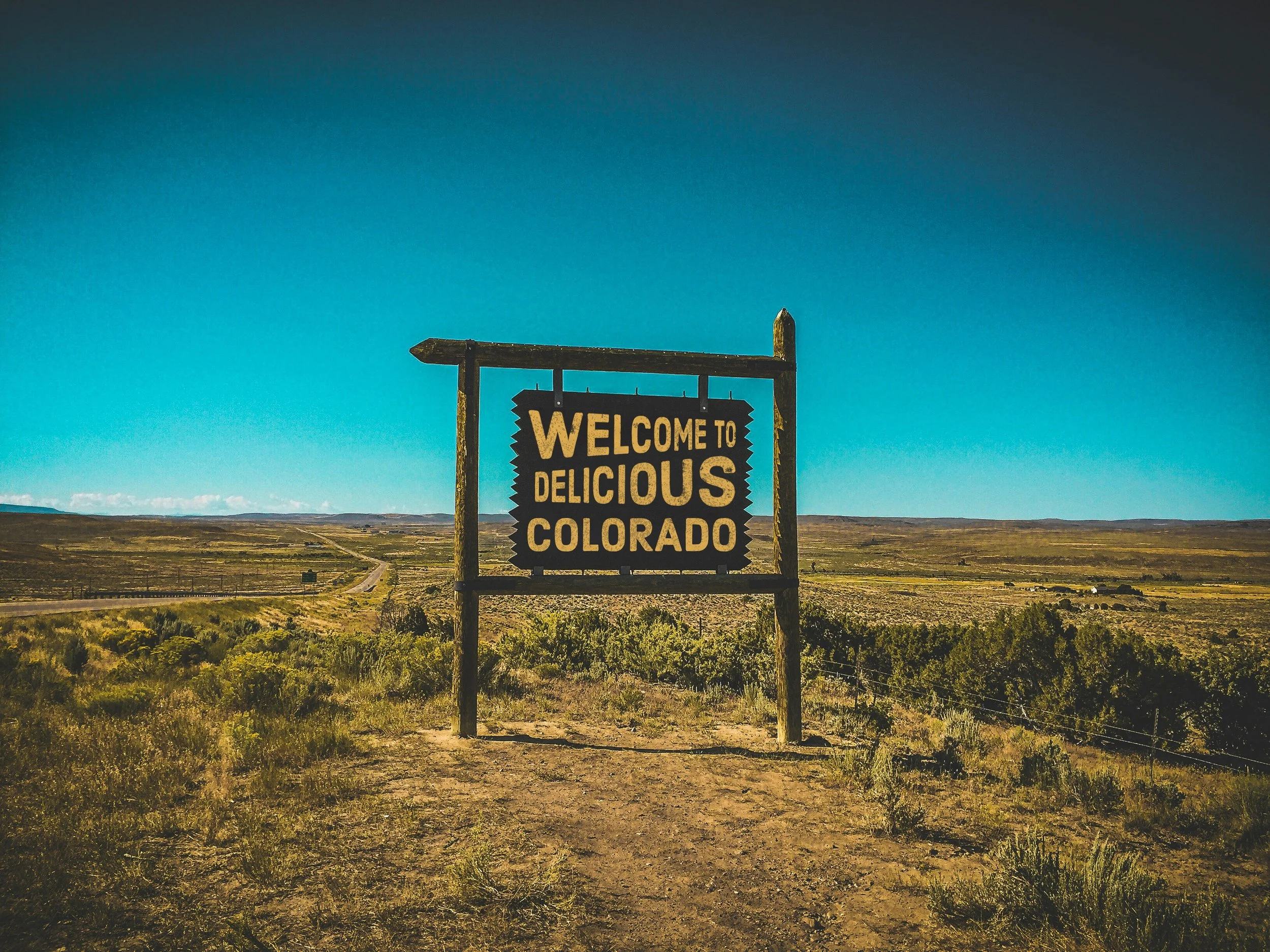
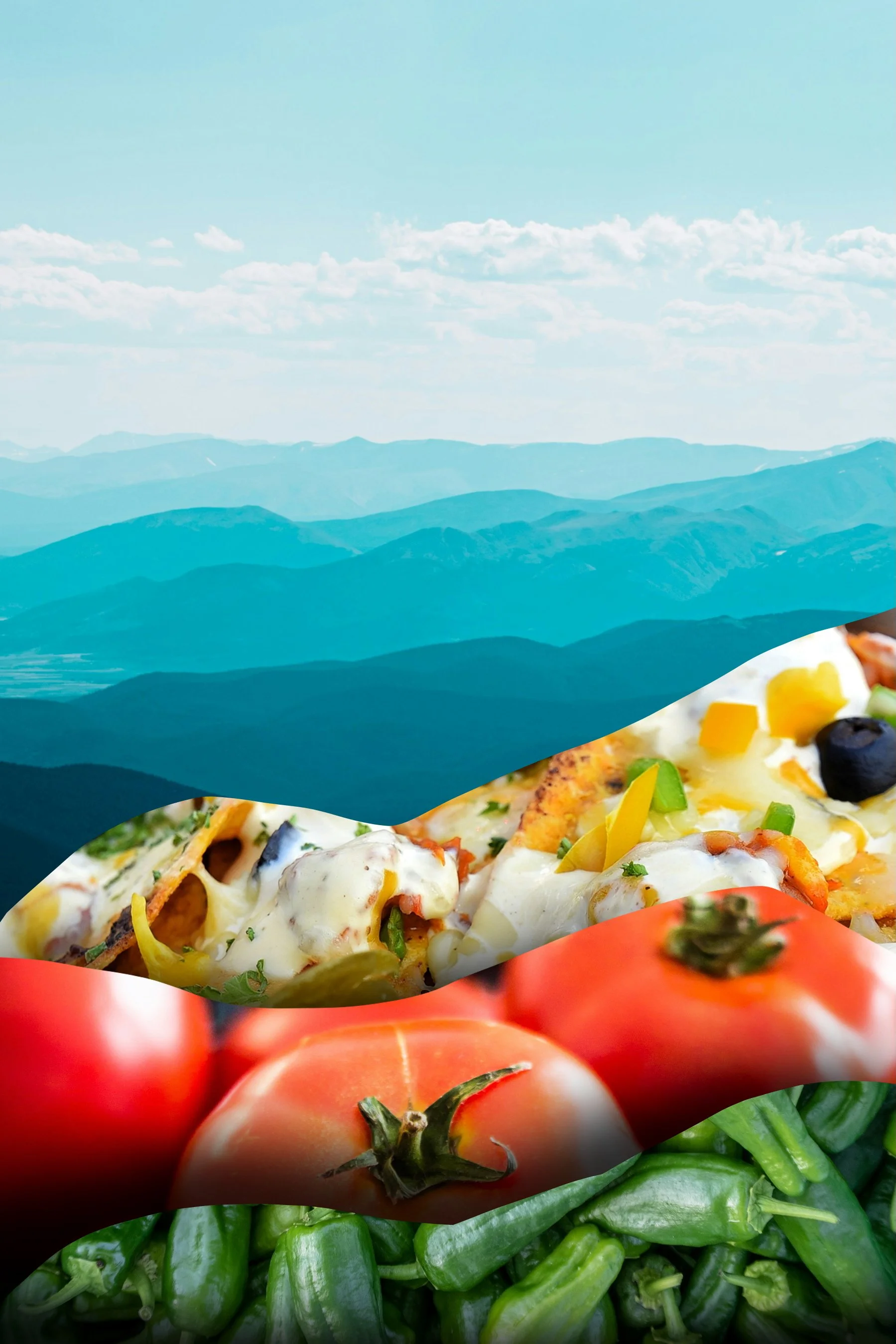
What visuals, other than mountains, convey the concept of “Colorado”?


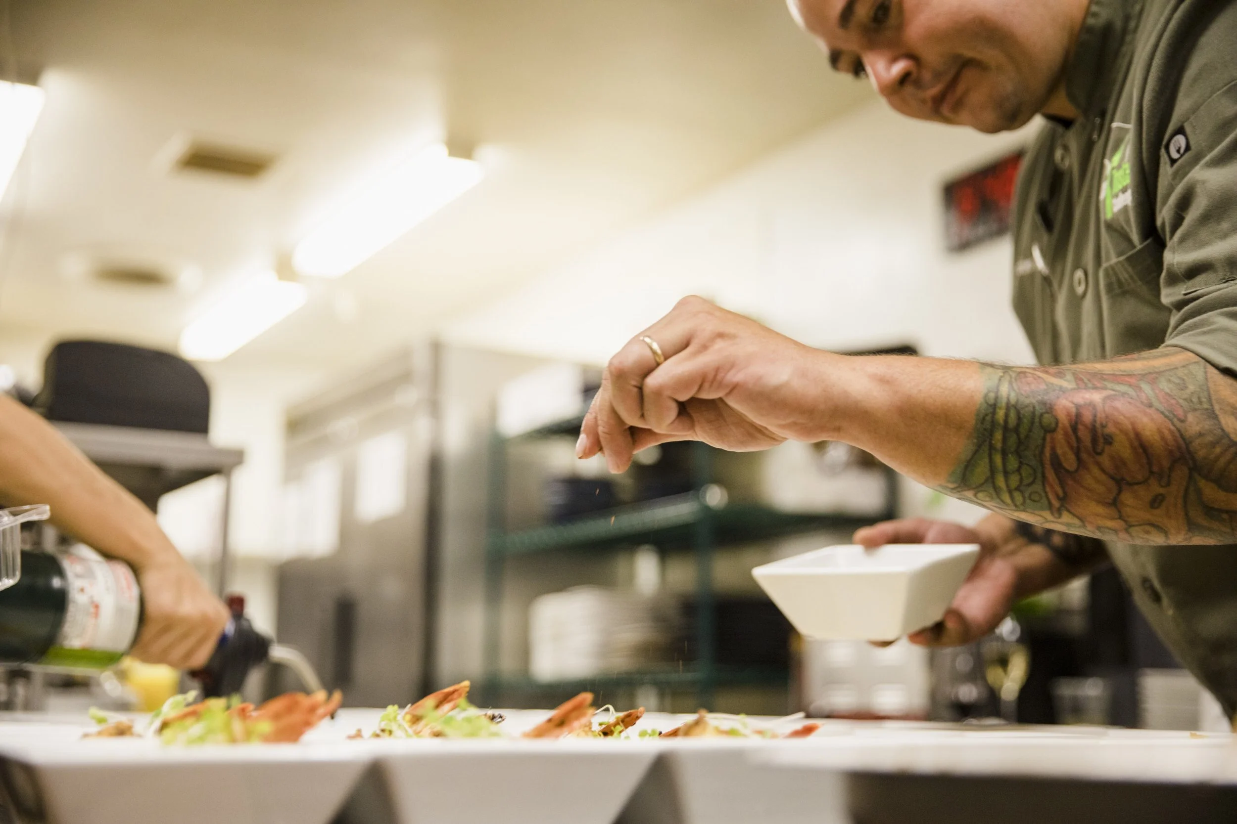
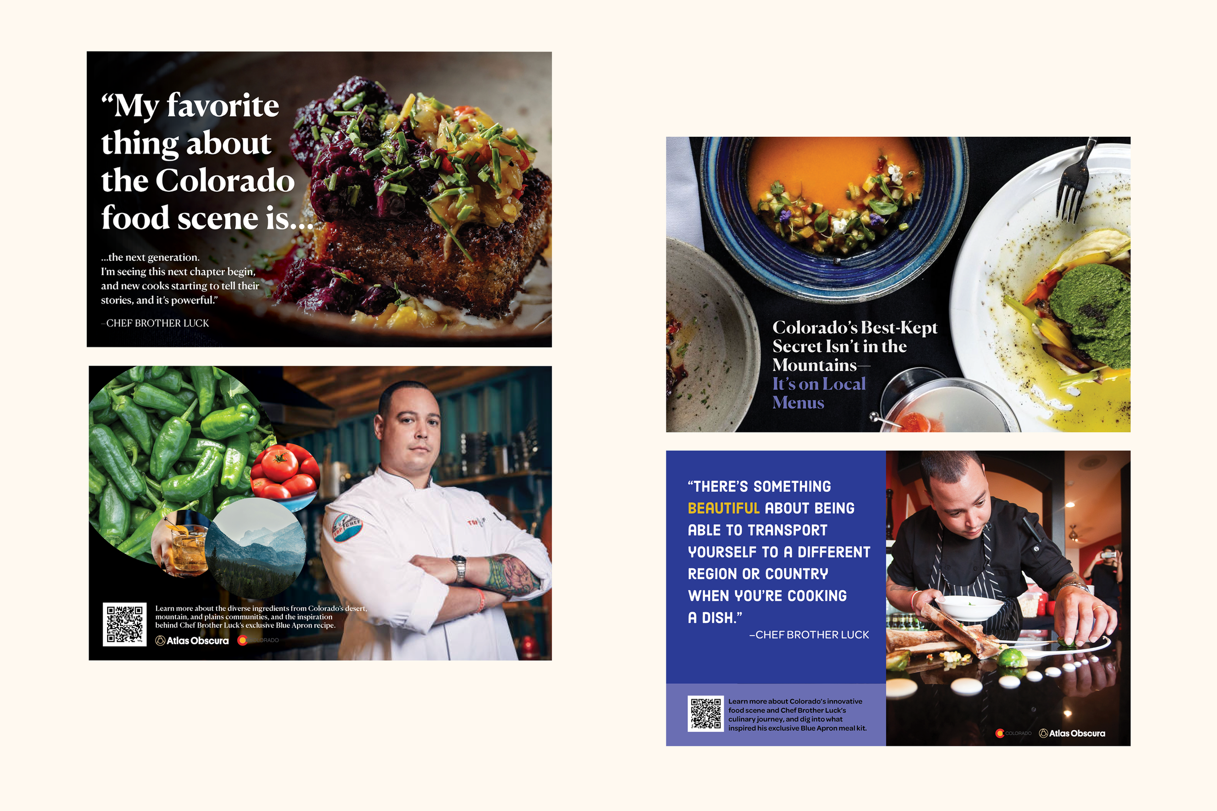
When I began work on this project, the creative direction for the campaign hadn’t yet been finalized. We didn’t have the final dish from Chef Brother Luck yet, or a cleared photo of him to use. Not one to be fazed by ambiguity, I pulled placeholder images from the chef’s restaurant website to supplement stock images of ingredients and foods common to Coloradan cuisine. I combined these with quotes he had given in the past, and some generic copy to help me begin to determine the flow that the card’s information might take. I also reviewed the Colorado Office of Tourism brand identity to identify key colors, typography and overall style that would need to be considered along the way.
In my broader research into Colorado as a state, I was delighted to learn Colorado had its own peach varietal, and was also known for green chilis. There’s a wine-growing region that many people (me!) don’t know about either. I pulled these inspirations together and got to work visualizing how we might communicate the vibe of Colorado through the lens of cuisine.
02 IDEATE
Some early ideas were easy to reject.
Wow. Yikes. No.
Clever, but boring.

Looks ok, but like, they DO literally sell meals?
03 ITERATE
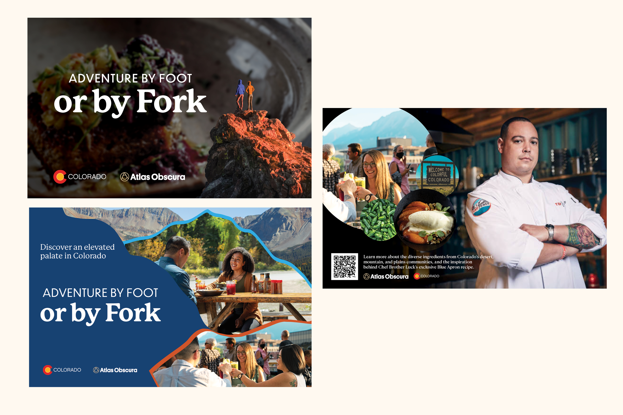
The first round of design drafts our team shared with the client leaned heavily on Chef Brother Luck and his approach to Coloradan cuisine. Since we didn’t have the photo of recipe (or even its name), the client’s creative team decided to refocus the direction on Colorado as an exciting travel destination. My CD suggested the headline “Adventure by Foot or by Fork”, which I loved for its simple way of conveying the idea that Colorado has great outdoor attractions- and culinary ones too.
I wanted to create negative space for the copy to live by creating solid shapes that echoed the form of mountains. We tried a few iterations of this idea, but in the end, the client preferred a cleaner look. I suggested we split the headline into front and back of the card, and with the client’s delight, we moved forward with that decision.
FIRST DRAFTS
SECOND DRAFTS
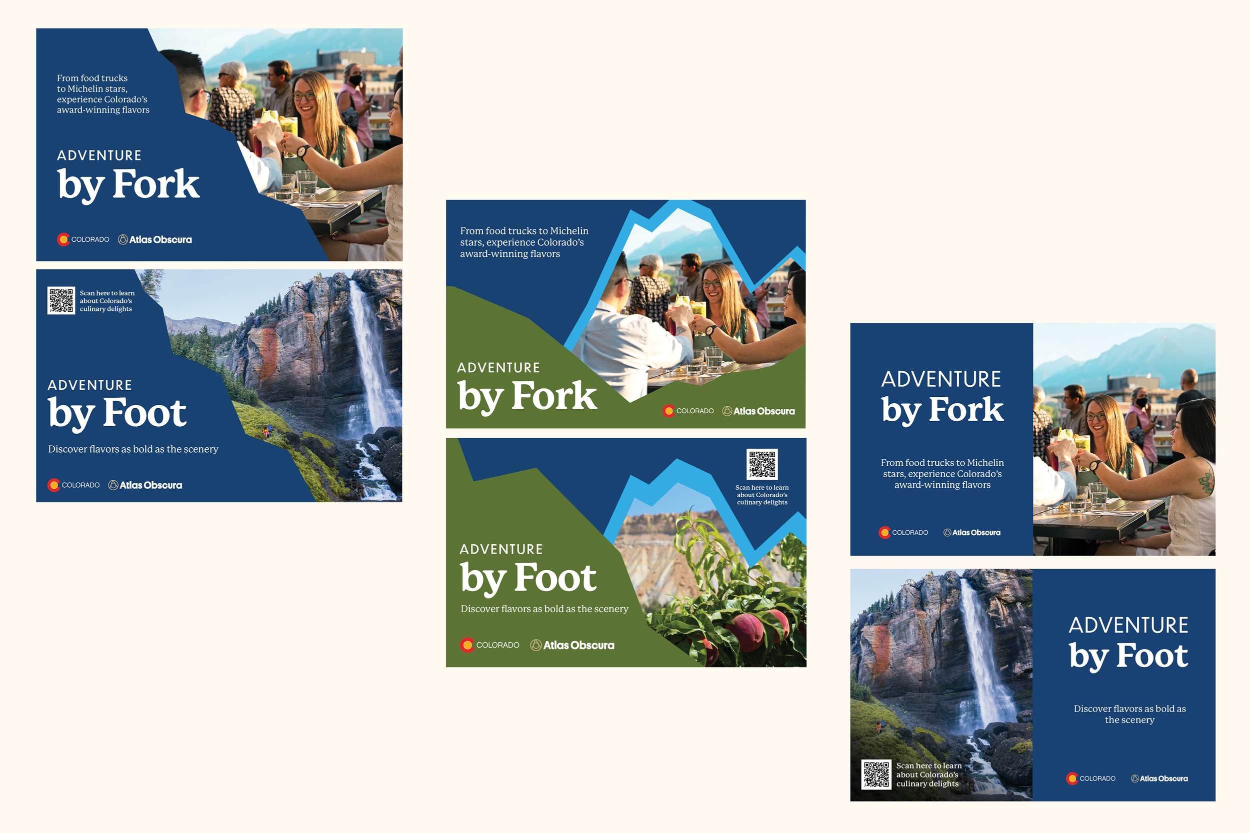
THIRD DRAFTS
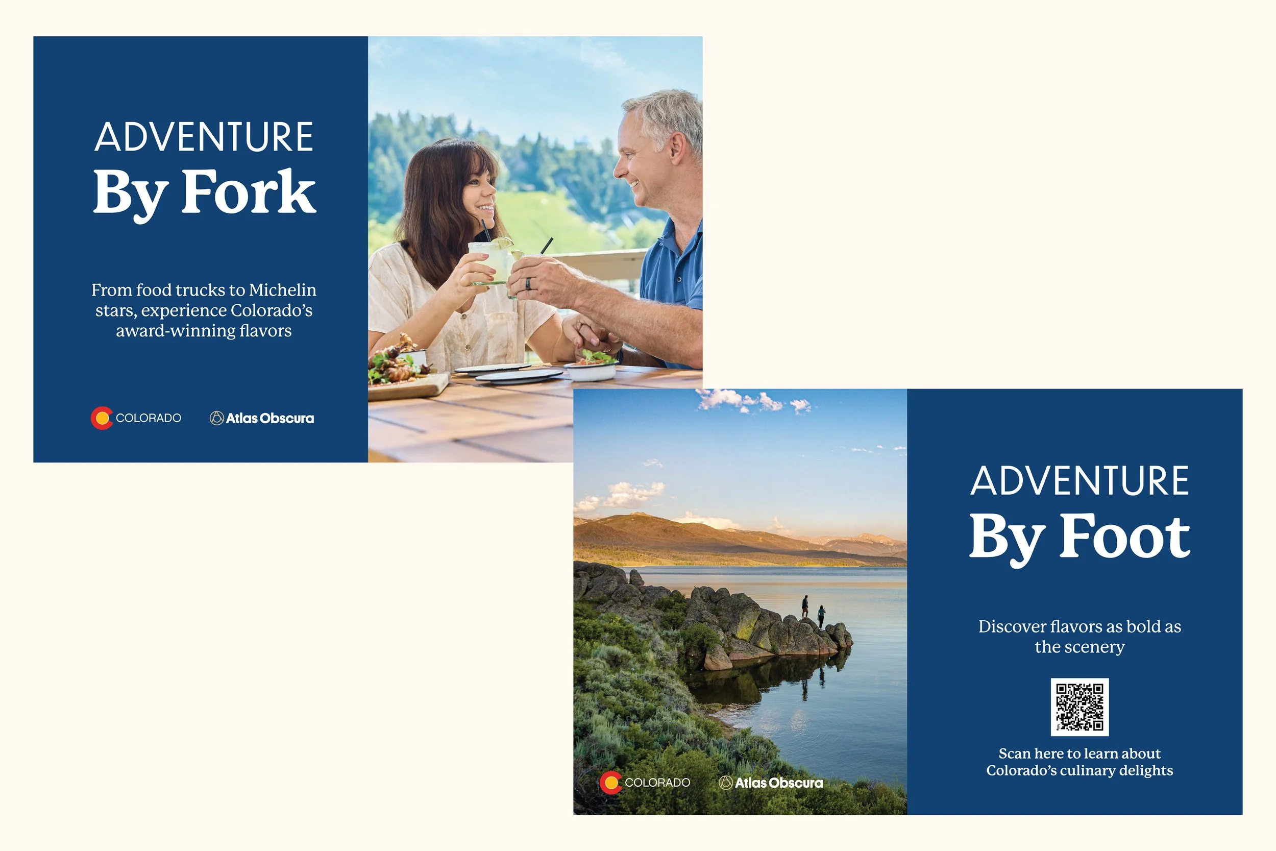
04 SHIP IT
The final product shipped in subscriber boxes, and included a QR code for customers to order the Colorado box. The Colorado Tourism Office agency shared with us that they calculated the partnership with Atlas Obscura and Blue Apron made a $210 million impact.
The campaign also won the 2025 DIGIDAY Content Marketing Awards for Best Multi-Channel Strategy.
Even though the client eventually went with a more minimalist design, I enjoyed the process of working through visual ideas and tying everything together based on their feedback.
Plus, as a mainly digital designer, it’s a thrill to see work printed in the real world.